Experiment Analysis
The Experiments section in GrowthBook is all about analyzing raw experiment results in a data source.
Before analyzing results, you need to actually run the experiment. This can be done in several ways:
- Feature Flags (most common)
- Running an inline experiment directly with our SDKs
- Our Visual Editor (beta)
- Your own custom variation assignment / bucketing system
When you go to add an experiment in GrowthBook, it will first look in your data source for any new experiment ids and prompt you to import them. If none are found, you can enter the experiment settings yourself.
Experiment Results Table
Once imported or added, go to the Results tab to view and update the results:
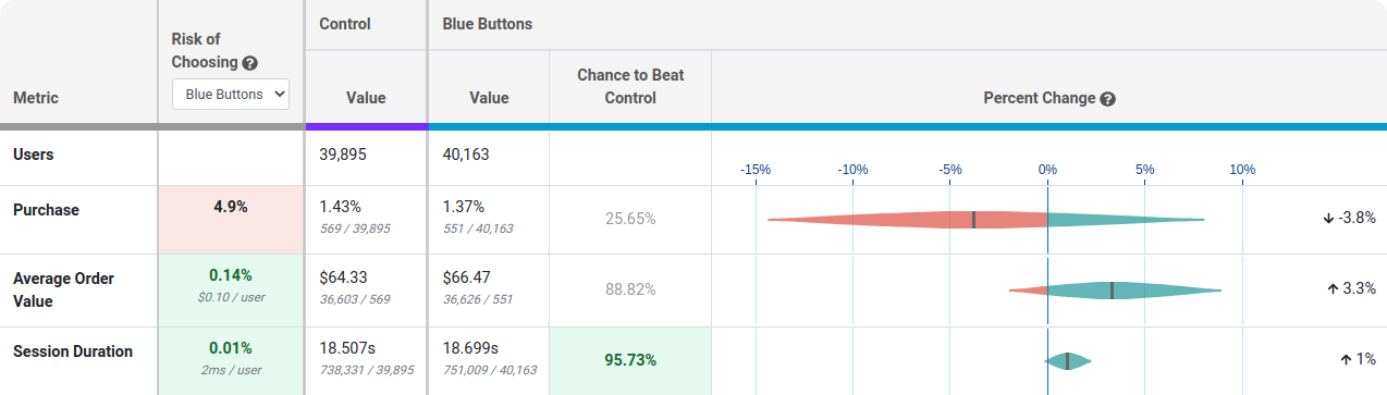
Each row of this table is a different metric.
Risk tells you how much you are predicted to lose if you choose the selected variation as the winner and you are wrong. Anything below 0.25% is highlighted green indicating the risk is very low and it's safe to call the experiment. You can use the dropdown to see the risk of choosing a different winner.
Value is the conversion rate or average value per user. In small print you can see the raw numbers used to calculate this.
Chance to Beat Control tells you the probability that the variation is better. Anything above 95% is highlighted green indicating a very clear winner. Anything below 5% is highlighted red, indicating a very clear loser. Anything in between is grayed out indicating it's inconclusive. If that's the case, there's either no measurable difference or you haven't gathered enough data yet.
Percent Change shows how much better/worse the variation is compared to the control. It is a probability density graph and the thicker the area, the more likely the true percent change will be there. As you collect more data, the tails of the graphs will shorten, indicating more certainty around the estimates.
Experiment Results Table (Frequentist Engine)
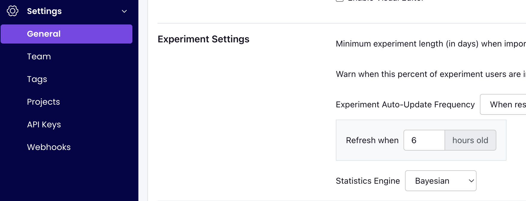
You can also choose to analyze results using a Frequentist engine that conducts simple t-tests for differences in means and displays the commensurate p-values and confidence intervals. You can switch to the frequentist engine under General -> Settings -> Experiment Settings -> Statistics Engine.
If you select the "Frequentist" engine, when you navigate to the results tab to view and update the results, you will see the following results table:
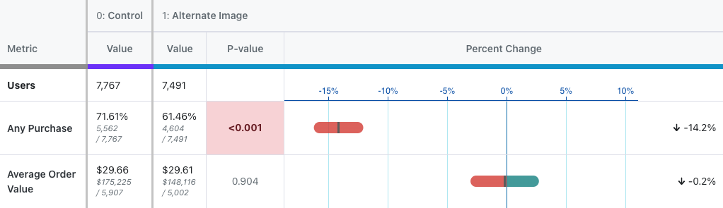
Everything is the same as above except for three key changes:
- There is no longer a risk column, as the concept is not easily replicated in frequentist statistics.
- The Chance to Beat Control column has been replaced with the P-value column. The p-value is the probability that the percent change for a variant would have been observed if the true percent change were zero. When the p-value is less than 0.05 and the percent change is in the preferred direction, we highlight the cell green, indicating it is a clear winner. When the p-value is less than 0.05 and the percent change is opposite the preferred diection, we highlight the cell red, indicating the variant is a clear loser on this metric.
- We now present a 95% confidence interval rather than a posterior probability density plot.
Sample Ratio Mismatch (SRM)
Every experiment automatically checks for a Sample Ratio Mismatch and will warn you if found. This happens when you expect a certain traffic split (e.g. 50/50) but you see something significantly different (e.g. 46/54). We only show this warning if the p-value is less than 0.001, which means it's extremely unlikely to occur by chance.

Like the warning says, you shouldn't trust the results since they are likely misleading. Instead, find and fix the source of the bug and restart the experiment.
Guardrails
Guardrail metrics are ones that you want to keep an eye on, but aren't trying to specifically improve with your experiment. For example, if you are trying to improve page load times, you may add revenue as a guardrail since you don't want to inadvertantly harm it.
Guardrail results show up beneath the main table of metrics and you can click on one to expand it and show more info. They are colored based on "Chance of Being Worse", which is just the complement of "Chance to Beat Control". If there are more than 2 variations, the max value is used to determine the overall color. A "Chance of Being Worse" less than 65% is green and of no concern. Between 65% and 90% is yellow and should be watched as more data comes in. Above 90% is red and you may consider stopping the experiment. If we don't have enough data to accurately predict the "Chance of Being Worse", we will color the metric grey.
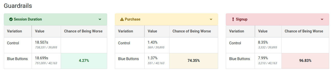
If you select the frequentist engine, we instead use yellow to represent a metric moving in the wrong direction at all (regardless of statistical significance), red to represent a metric moving in the wrong direction with a two-sided t-test p-value below 0.05, and green to represent a metric moving in the right direction with a p-value below 0.05. Otherwise the cell is unshaded if the metric is moving in the right direction but not statistically significant at the 0.05 level.
Dimensions
If you have defined dimensions for your data source, you can use the Dimension dropdown to drill down into your results. This is very useful for debugging (e.g. if Safari is down, but the other browsers are fine, you may have an implementation bug).
Be careful. The more metrics and dimensions you look at, the more likely you are to see a false positive. If you find something that looks surprising, it's often worth a dedicated follow-up experiment to verify that it's real.